本站资源全部免费,回复即可查看下载地址!
您需要 登录 才可以下载或查看,没有帐号?立即注册
x
CSS效果1.使用div绘制图形(三角形)[HTML] 纯文本查看 复制代码 <!DOCTYPE html>
<html lang="en">
<head>
<meta charset="UTF-8">
<title>Title</title>
<style>
.triangle-top {
width: 0;
height: 0;
border-width: 0 40px 40px;
border-style: solid;
border-color: transparent transparent red;
}
.triangle-bottom {
width: 0;
height: 0;
border-style: solid;
border-width: 40px 40px 0 40px;
border-color: blueviolet transparent transparent transparent;
}
.triangle-left {
width: 0;
height: 0;
border-style: solid;
border-width: 40px 0 40px 40px;
border-color: transparent transparent transparent #89ff56;
}
.triangle-right {
width: 0;
height: 0;
border-style: solid;
border-width: 40px 40px 40px 0;
border-color: transparent yellowgreen transparent;
}
/*缺口的三角形*/
.box{
position: absolute;
left: 0;
top: 0;
width: 0;
height:0;
border: 6px solid transparent;
}
.b1{
/*底层的盒子三角形相当于全部是黑色的*/
border-bottom-color:#000 ;
}
.b2{
/*上层的为白色覆盖*/
border-bottom-color:#fff ;
}
</style>
</head>
<body>
<div class="triangle-top"></div>
<div class="triangle-bottom"></div>
<div class="triangle-left"></div>
<div class="triangle-right"></div>
<div class="box b1"></div>
<div class="box b2"></div>
</body>
</html>
2.如何产生一个不占空间的边框?( box-sizing属性)?#[!NOTE]
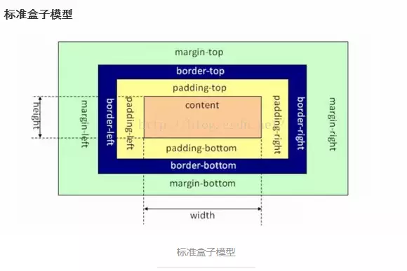
知识点:IE和标准盒子模型的异同点
- 标准盒子模型:元素的width或height=content的width或height;
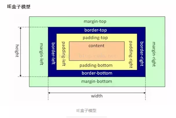
- IE盒子模型:元素的width或height=content的width或height+padding2+border2;
[HTML] 纯文本查看 复制代码 /*IE盒子模型:width_sum = margin + width*/
.border-box-use {
box-sizing : border-box;
/*通过IE的盒子模型设置出来之后,这个盒子内容区域的宽度实际只有180px
这里指定的width 实际上是包含了border的宽度的
*/
width: 200px;
height: 200px;
border: 10px solid #89ff56;
}
/*标准盒子模型:width_sum = margin + width + padding + width*/
.border-content-box-use {
/*设置为标准的盒子模型,默认值*/
box-sizing: content-box;
width: 200px;
height: 200px;
padding: 1px;
border: 10px solid #ff255f;
}
.parent-box-inhrit {
/*设置当前的盒子模型是从父级盒子中继承,这里相当于是继承了IE的盒子模型*/
box-sizing: inherit;
width: 50px;
height: 50px;
background-color: #48adff;
border: 1px solid #000;
/*对一个元素自身设置padding,相当于是把盒子撑大了*/
padding: 5px;
}
2.1 使用box-shadow实现#[HTML] 纯文本查看 复制代码 /*box-shadow 制作边框*/
.box-shadow-border {
width: 200px;
height: 200px;
/*设置外阴影:x y 模糊区域 扩展区域*/
box-shadow: 0 0 0 10px red , 0 0 0 10px blue;
}
2.2 使用outline实现
在元素边框边缘的外围绘制一条包围元素的线,包括outline-color、outline-style、outline-width三个子属性的设置,可缺省,无固定顺序。轮廓不占据页面空间,也不一定是矩形。即不会增加额外的width或者height。
[HTML] 纯文本查看 复制代码 .borner-no-space {
width: 200px;
height: 200px;
outline: 10px solid red;
}
3.如何实现IOS图标的圆角?
[HTML] 纯文本查看 复制代码 /*clip-path的使用
1. 对容器进行裁剪
2. 常见集合图形
3. 自定义路径
*/
.container-clippath {
width: 400px;
height: 300px;
border: 1px solid #000;
background-image: url("bg.jpg");
background-size: contain;
background-repeat: no-repeat;
background-position: center center;
/*开始进行区域裁剪*/
/*clip-path: circle(50px at 100px 100px);*/
/*clip-path: inset(100px 50px);*/
clip-path: polygon(50% 0%, 100% 50%, 50% 100%, 0% 50%);
/*同时,也是支持svg矢量图的裁剪*/
}
.container-clippath:hover {
clip-path: circle(80px at 100px 100px);
5.说下背景图的居中显示/重复/改变大小?
[HTML] 纯文本查看 复制代码 background-position: 背景图片相对容器原点的起始位置
background-repeat
background-size : cover/contain(设置大小)
[HTML] 纯文本查看 复制代码 /* 一个值: 这个值指定图片的宽度,那么第二个值为auto */
background-size: auto
background-size: 50%
background-size: 3em
background-size: 12px
/* 两个值: 第一个值指定图片的宽度,第二个值指定图片的高度 */
background-size: 50% auto
background-size: 3em 25%
background-size: auto 6px
background-size: auto auto
/*多重背景,请用逗号隔开,在CSS语法中凡语法后跟*或者#,都是可以无限重复的,但是必须用逗号隔开。 */
background-size: auto, auto /* 不要跟background-size: auto auto混淆了 */
background-size: 50%, 25%, 25%
background-size: 6px, auto, contain
background-size: inherit
6.如何平移/放大一个元素?如何实现0.5px的边框?#[!NOTE]
知识点:transform的灵活使用
[HTML] 纯文本查看 复制代码 <style>
.custom-border{
width:200px;
margin:10px auto;
height:100px;
border:1px solid #333;
background-color:#eee;
padding:10px;
}
.scale-border{
margin:10px auto;
height:100px;
position:relative;
padding:10px;
width: 200px;
}
.border{
-webkit-transform:scale(0.5);
transform:scale(0.5);
position:absolute;
border:1px solid #333;
top:-50%;
right:-50%;
bottom:-50%;
left:-50%;
background-color:#eee;
}
.content{
position:relative;
z-index:2;
}
</style>
<body>
<div class="custom-border border-color">边框宽度1px</div>
<div class="scale-border">
<div class="content">边框宽度0.5px</div>
<div class="border border-color"></div>
</div>
</body>
</html>
7.如何实现3D效果(旋转的硬币)?
[HTML] 纯文本查看 复制代码 /* 1. 设置一个透视变换,相机距离图像的距离 */
/* perspective : 500px */
/* 2. 设置视觉查看的样式 */
/* transform-style : perspective-3d */
/* 3. 变换图像 */
/* transform : translate rotate */
/*旋转的硬币效果*/
.money {
width: 100px;
height: 100px;
border-radius: 50px;
background-color: #48adff;
border: 2px solid #000;
/*开启3D效果*/
perspective: 500px;
transform-style: preserve-3d;
/*transform : rotateY(180deg);*/
animation : rotate 2s linear infinite;
}
@keyframes rotate {
from {
transform : rotateY(0deg);
}
to {
transform : rotateY(360deg);
}
}
| 


 发表于 2020-4-15 14:00:00